Moeky: A Futuristic Display Typeface for Digital Design
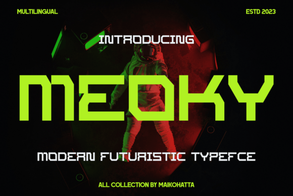
As a web and UI designer who ships dozens of landing pages, SaaS dashboards, and e-commerce experiences each year, I pay close attention to how type shapes perception before a user reads a single word. Moeky isn’t just another decorative font—it’s a purpose-built display typeface engineered for the digital era. Its clean, geometric letterforms echo interface elements, circuit patterns, and minimalist tech interfaces—without sacrificing legibility or visual weight.
Moeky thrives where impact meets intention: hero section headlines, product name treatments, CTA buttons, app onboarding screens, and branded banner graphics. Its sharp terminals, balanced x-height, and subtle optical corrections make it highly readable at large sizes—even over complex image overlays or gradient backgrounds. On mobile, Moeky scales cleanly in responsive headers thanks to its well-hinted outlines and consistent stroke contrast across weights.
Where Moeky Delivers Real Design Value
Unlike experimental fonts that sacrifice usability for novelty, Moeky was built with web performance and real-world layout constraints in mind. It includes multiple weights (Light, Regular, Bold, ExtraBold), true italics, and OpenType features like stylistic alternates and case-sensitive forms—critical for refining microcopy in digital products. Webfont formats (WOFF2, WOFF) are optimized for fast loading, and variable font support is available for advanced typographic control without bloating page weight.
- Hero sections: Use Moeky Bold at 64–96px on light or dark backgrounds—its tight spacing and vertical rhythm anchor attention instantly.
- Landing page CTAs: Pair Moeky Regular with a high-contrast sans serif body font; the contrast reinforces action hierarchy without visual noise.
- Online store banners: Apply Moeky to limited-edition drops or launch announcements—it signals innovation and premium positioning without needing extra icons or badges.
- Portfolio & creative sites: Moeky works especially well for designers, developers, and digital artists whose work lives at the intersection of code and craft.
- Course and membership sites: Use Moeky for module titles and course names to imply forward-thinking content—ideal for tech education, UX bootcamps, or AI tooling brands.
Readability & Responsiveness in Practice
Moeky performs best at headline sizes (32px and up) on desktop and 28px+ on mobile. Avoid using it for paragraph text or small UI labels—its display DNA means it’s not designed for extended reading. For accessibility, always pair Moeky with a tested, WCAG-compliant sans serif (like Inter, Manrope, or IBM Plex Sans) for body copy, navigation, and form fields. That pairing creates clear visual separation: Moeky sets tone and intent; your secondary font delivers clarity and trust.
On dark mode interfaces, Moeky’s crisp edges hold up exceptionally well—especially when rendered with subpixel antialiasing disabled in CSS (text-rendering: optimizeLegibility;). For image overlays, use a subtle text shadow (text-shadow: 0 2px 4px rgba(0,0,0,0.3);) to ensure contrast meets AA standards. And yes—it supports Latin, Greek, and Cyrillic character sets, making it viable for multilingual SaaS dashboards and global brand kits.
Smart Font Pairing for Cohesive Digital Identity
Moeky doesn’t need ornate companions. Its strength lies in restraint. For most web projects, pair it with a neutral, highly legible sans serif: Inter for technical or data-driven brands, Poppins for friendly SaaS tools, or Montserrat for editorial-leaning digital magazines. If your brand leans into craftsmanship or editorial depth, try Moeky with a refined serif like Crimson Pro or Literata—but only for headings and pull quotes. Never use two display fonts together; Moeky’s personality is strong enough to carry the voice alone.
For logo design or wordmark treatment, Moeky’s uppercase-only variants and monospaced alternatives offer flexibility—just ensure kerning is manually adjusted in vector editors. And if you’re building reusable design systems or Figma UI kits, Moeky’s consistent metrics across weights simplify component scaling and token-based typography setups.
Licensing for Real-World Use
Moeky is a commercial font—and that matters. When licensing for client work, online stores, or digital templates, confirm whether your license covers web embedding (via @font-face), SaaS application usage, and resale in theme or template marketplaces. Most Moeky licenses include unlimited domains for personal or agency use, but always verify redistribution rights if bundling into a Shopify theme or Notion template. Using unlicensed fonts risks legal exposure and inconsistent rendering—especially when fonts fail to load and fallbacks break your carefully crafted hierarchy.
In practice, Moeky has become my go-to for projects where brand clarity and digital authenticity matter more than trend-chasing. It’s not “futuristic” as in sci-fi cliché—it’s futuristic as in *designed for how people actually interact with interfaces today*: quickly, contextually, and across devices. Whether you’re launching a new AI tool, redesigning a boutique e-commerce site, or building a portfolio that reflects your technical precision, Moeky delivers tone, structure, and polish—without demanding extra design labor to make it work.
If your current display font feels dated, overused, or visually disconnected from your product’s actual functionality, Moeky offers a refresh that’s both expressive and engineered—ready for production, performant by default, and unmistakably of this moment.