Oakside: A Bold Extended Typeface for Digital Impact
As a web designer who ships dozens of landing pages, SaaS dashboards, and e-commerce sites each year, I don’t reach for display fonts lightly. They need to earn their place—delivering clarity at scale, reinforcing brand voice without sacrificing usability, and performing flawlessly across devices. That’s why Oakside stands out: it’s not just another decorative typeface. It’s a bold extended typeface engineered for digital prominence—structured enough for hierarchy, expressive enough for identity, and refined enough for conversion-focused interfaces.
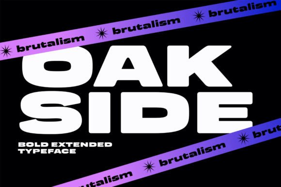
Oakside lives firmly in the display font category—but with intention. Its extended proportions, generous x-height, and carefully balanced stroke contrast make it highly legible even at smaller sizes on screen. Unlike many display fonts that crumble below 48px, Oakside holds its own as a section heading on mobile, a hero title over a video background, or a bold CTA button on a dark-mode interface. The letterforms are confident but never aggressive—slightly geometric, subtly organic, and grounded in modern typography principles.
In practice, Oakside excels where visual weight and tonal clarity matter most. Use it for hero section headlines that anchor attention above the fold. Deploy it for product name treatments on online store banners or app onboarding screens. Apply it selectively to section dividers, testimonial quotes, and course module titles—anywhere you need to signal importance without relying on color or layout alone. It’s especially effective for brands with a refined, contemporary, or artisanal tone: boutique studios, wellness coaches, independent publishers, and premium B2B tools all benefit from its quiet authority.
Readability isn’t compromised—it’s recalibrated. On light backgrounds, Oakside’s open counters and consistent spacing support rapid scanning. Over image overlays or gradient backgrounds, its extended width increases surface area for contrast, helping text remain legible without heavy drop shadows or opaque containers. On mobile, I recommend using Oakside at minimum 32px for headings and always pairing it with responsive font-size units (like clamp()) to maintain rhythm across viewports. Avoid setting it below 24px for body-level use—even though it *can* read there, its personality is strongest when given room to breathe.
Visual hierarchy becomes intuitive with Oakside. Because it’s designed as a display font—not a text face—it naturally commands attention. That means you can reduce reliance on size jumps or bolding elsewhere in your layout. Pair Oakside with a clean, neutral sans serif (think Inter, Manrope, or IBM Plex Sans) for body copy, navigation, and form labels. This pairing creates clear typographic contrast while preserving harmony: Oakside sets the tone; the sans carries the information. For editorial or luxury-facing sites, try pairing it with a restrained serif like Literata or Cormorant Garamond—just ensure the serif has ample line height and generous letter-spacing in UI contexts.
Oakside includes multiple weights—Light, Regular, Medium, Bold—with matching italics and OpenType features like stylistic alternates and ligatures. These aren’t just flourishes: the alternates let you fine-tune rhythm in tight spaces (like navigation bars or mobile menus), and the range of weights supports layered hierarchy without switching families. Webfont files are optimized for fast loading—WOFF2 included—and support Latin-based languages with full diacritic coverage. If your audience spans European or Canadian markets, you’ll appreciate the robust multilingual support baked in.
For real-world applications: a creative portfolio site uses Oakside for project titles overlaid on full-bleed imagery—its extended shape fills horizontal space without crowding. A coaching website applies it to “Book a Call” buttons and course headers, reinforcing commitment and clarity. An online ceramic shop deploys Oakside across product cards and banner text, evoking craftsmanship and timelessness without feeling dated. Even in email headers or social media ad creatives exported from Figma, Oakside scales cleanly and retains its character.
One practical note: Oakside is a commercial font, and licensing matters. The standard web license covers usage on live domains—including client sites, SaaS platforms, and online stores—as long as it’s served via @font-face or a licensed CDN. If you’re building reusable templates (Figma kits, WordPress themes, Notion templates), verify the extended license terms. Never self-host or redistribute font files outside your licensed scope—especially in public repositories or template marketplaces. Licensing isn’t bureaucracy; it’s how we sustain high-quality design assets and respect the craft behind type creation.
What makes Oakside different isn’t just how it looks—it’s how it behaves in context. It doesn’t shout. It asserts. It doesn’t distract. It directs. In an ecosystem saturated with generic sans serifs and overused script fonts, Oakside offers a rare balance: distinctive enough to build recognition, disciplined enough to scale across digital touchpoints, and versatile enough to adapt—from a minimalist blog header to a vibrant digital ad campaign. When your brand needs typography that works as hard as your code and content, Oakside earns its place—not as decoration, but as infrastructure.
Whether you're refining a brand identity system, optimizing a conversion funnel, or designing your first portfolio site, treat Oakside as a strategic tool—not just a stylistic choice. Its extended proportions, intentional spacing, and digital-first construction make it one of the few display fonts that truly perform across the full spectrum of web and app interfaces.