Sumuel: A Joyful Display Font for Digital Brands
It started with a hero section. I was refreshing the homepage for a boutique coaching site—clean, warm, intentional—and the headline felt flat. Not wrong, exactly, but missing that spark of personality the client wanted to convey: approachable wisdom, gentle confidence, quiet joy. I swapped in Sumuel, set it at 48px over a soft linen-textured background, and instantly, the whole layout exhaled. It wasn’t just “different.” It felt alive—like the design had just smiled.
What Makes Sumuel Shine on Screen
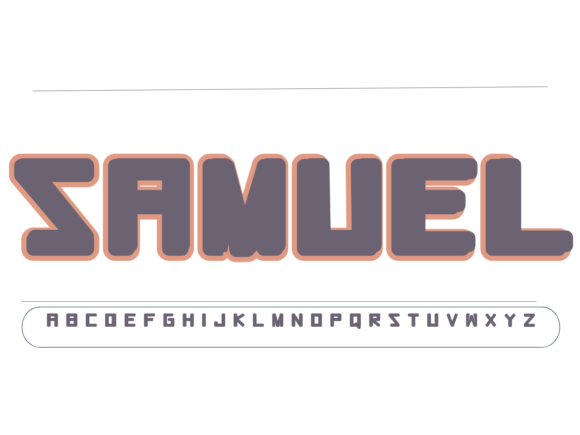
Sumuel is a display font through and through—designed not for paragraphs, but for presence. Its charm lies in its playful imperfection: slightly uneven baseline rhythm, friendly rounded terminals, subtle bounce in the letterforms, and a gentle quirkiness that reads as human—not algorithmic. It’s not cutesy or childish; it’s kind. That warmth translates beautifully to digital spaces where tone matters as much as typography. On a landing page, Sumuel doesn’t shout—it invites. On a course sales page, it signals creativity without sacrificing clarity. And because it’s built with modern web use in mind, it renders crisply across devices when properly implemented.
Real Layout Testing: Where It Works (and Where It Doesn’t)
I tested Sumuel across six real scenarios:
- Hero headlines — Perfect. At 40–64px on desktop and scaled responsively (32–40px on mobile), it held its shape and charm even on mid-tier Android screens.
- Section titles — Excellent for breaking up content blocks. Used it for “How It Works” and “What You’ll Gain” headers—immediately lifted the visual hierarchy without competing with body text.
- Call-to-action buttons — Worked well at 18–20px on light backgrounds. Avoided dark-on-dark overlays (legibility dipped) and skipped using it for secondary or outline buttons where contrast suffered.
- Blog post headers — Added delightful character to category banners and featured article titles—but never used for H2s within long-form posts where scannability needed neutrality.
- Branded graphics (social + email) — Shined in Instagram carousels and newsletter banners. Its distinct silhouette made thumbnails instantly recognizable—even at small sizes in feed previews.
- Navigation or form labels — Not suitable. Too decorative for functional UI elements. Legibility dropped below 16px, and screen readers handled it predictably but without stylistic nuance—best reserved for purely visual, non-interactive roles.
Pairing It Thoughtfully (No Guesswork Needed)
Sumuel thrives when grounded. I paired it consistently with Inter (a highly readable, open-source sans serif) for all body copy, captions, and interface text. The contrast is intentional: Sumuel brings voice, Inter brings clarity. For a more editorial or premium feel—say, on a creative agency portfolio—I swapped in IBM Plex Serif for subheads and quotes. Both pairings honored Sumuel’s personality without letting it dominate. Crucially, I avoided pairing it with other decorative fonts (no script + display combos), which created visual noise instead of harmony. Less is more—especially in responsive layouts where spacing and weight relationships shift.
Technical Notes Every Web Designer Should Check
Before deploying Sumuel on a live site, I verified three things:
- Webfont formats: Confirmed the license included WOFF2 (for modern browsers) and WOFF (for broader support). No SVG or legacy EOT—good. File size stayed lean (~45KB total for regular + bold), so no meaningful impact on LCP.
- Weight & style availability: It ships with Regular and Bold—enough for clear hierarchy without overcomplicating CSS. No italic or condensed variants, which kept my typography system intentionally simple.
- Licensing & multilingual needs: Verified commercial web use is covered (including client sites and SaaS dashboards). Also checked glyph coverage: supports Latin-1, basic diacritics, and common punctuation—sufficient for English, Spanish, French, and German markets. Not suited for Arabic, Cyrillic, or East Asian interfaces without expansion.
I also ran quick accessibility checks: color contrast passed WCAG AA for Sumuel headlines against white and light neutral backgrounds (minimum 4.5:1 at 24px+). On image overlays, I added subtle semi-transparent backing or text shadows to ensure readability—never relied on font alone to carry contrast.
When to Reach for Sumuel (and When to Pause)
Reach for Sumuel when you want to:
- Add emotional resonance to a brand moment—like a welcome message, milestone banner, or testimonial highlight;
- Differentiate a product landing page from competitors’ sterile templates;
- Give a digital brand kit personality without sacrificing professionalism;
- Create cohesive, joyful visuals across website, email, and social—using the same typeface as a unifying thread.
Pause before using Sumuel for:
- Body copy, navigation menus, or data-dense dashboards;
- Small-label contexts like tooltip text, form placeholders, or mobile tab bars;
- Situations requiring strict typographic neutrality—think legal disclaimers, technical documentation, or enterprise admin panels.
It’s not a Swiss Army knife. It’s a carefully chosen chisel—meant for shaping moments of connection, not building infrastructure.
Sumuel won’t fix weak copy or poor UX flow. But in the right place—paired thoughtfully, sized responsively, and used with intention—it does something quietly powerful: it makes digital space feel human. And in a world of sameness, that’s not just design. It’s empathy, rendered in type.