Melipe: A Playful Display Font That Lifts Your Digital Brand
I was halfway through designing a new landing page for a children’s illustration course—bright colors, hand-drawn icons, soft shadows—and the headline just felt flat. I’d tried three clean sans serifs, two friendly rounded fonts, and even a subtle serif. Nothing captured that spark of imagination and gentle charm the brand needed. Then I loaded Melipe.
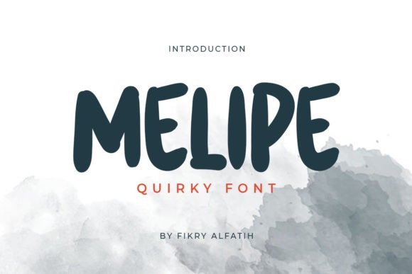
Right away, it clicked. Not as body text—no, Melipe isn’t built for paragraphs—but as a display font, it sings. Its letterforms have a light bounce, slightly uneven baselines, and subtle quirks: a tilted ‘e’, a looping ‘g’, a ‘y’ with a cheerful upward flick. It’s not cartoonish or over-the-top. It’s playful with intention—a premium font that feels handmade but remains legible, consistent, and digitally refined.
I dropped Melipe into the hero section first. Set at 48px on desktop, 36px on tablet, and 28px on mobile (with generous line-height and letter-spacing), it held up beautifully—even over a soft gradient overlay. No blurring, no rendering hiccups in Chrome or Safari. The webfont loaded fast, and the included WOFF2 format kept the file lean. I tested it across devices: crisp on Retina screens, still readable on older Android browsers, and surprisingly resilient against low-contrast backgrounds when paired with a subtle text shadow or white stroke.
Where Melipe shines is in moments that need personality—not persistence. Think: a course sales page where “Enroll Now” sits beneath a joyful headline like “Draw With Confidence”; a creative portfolio homepage where the designer’s name becomes part of the visual rhythm; or a small business website for an indie toy shop, where “New Arrivals” or “Storytime Kits” feel like invitations, not labels.
It’s not ideal for navigation menus, form fields, or dense product descriptions. But as a display font, Melipe excels in short, high-impact spots: hero titles, section headers (“Why This Course Works”), CTA buttons (“Start Drawing Today”), testimonial quotes, blog post titles, and branded social media graphics exported from Figma. I used it for animated hover states on cards—just a slight scale-up and color shift—and the whimsy amplified without feeling gimmicky.
Readability is where thoughtful usage matters most. On mobile, I kept Melipe to headlines only—never below 24px—and always paired it with generous padding and contrast. Over image banners? I added a semi-transparent dark overlay behind the text block—not just for aesthetics, but to ensure WCAG-compliant contrast ratios. And on dark mode layouts, I switched to a slightly lighter weight (when available) or adjusted tracking to avoid visual crowding.
Font pairing was effortless. For body copy, I went with a warm, neutral sans serif—something like Inter or Poppins—clean enough to recede but with enough character to feel cohesive. The contrast worked beautifully: Melipe brought energy; the sans serif brought clarity. For more editorial contexts—say, a blog redesign with long-form storytelling—I’ve paired Melipe with a soft serif like Cormorant Garamond for subheads, letting the display font anchor each section while the serif adds quiet sophistication.
Before committing, I checked what came with the Melipe package: multiple weights (Light, Regular, Bold), true italics (not slanted), standard OpenType features, and solid multilingual support—including extended Latin characters for European languages. No surprises in client handoff: the webfont kit included CSS-ready @font-face declarations, and the commercial license clearly covers SaaS dashboards, online stores, and digital templates. No hidden restrictions for e-commerce platforms or hosted landing pages.
One thing I appreciated: Melipe doesn’t try to be everything. It’s not a variable font, and it doesn’t include ultra-narrow or monospace variants. That’s fine—it knows its role. As a display font, it’s focused, expressive, and reliable. It won’t solve weak layout hierarchy or poor color choices, but it *does* elevate intentional design. When your brand voice leans toward warmth, creativity, and approachability—especially in spaces like coaching websites, boutique online stores, or educational offerings—it adds a layer of authenticity that generic system fonts simply can’t replicate.
I also tested it in real layout scenarios beyond the hero: as a decorative accent in a testimonial carousel (just the speaker’s name), inside a pricing card header (“Creative Bundle”), and even subtly in favicon-sized branding—scaled down to 16px, it retained its charm without sacrificing recognition. Not every display font holds up that small, but Melipe’s open counters and balanced proportions made it work.
What surprised me most wasn’t how well Melipe performed—but how much it shifted the tone of the entire page. Users didn’t just read the headline; they paused. Smiled. Scrolled slower. That subtle emotional resonance is hard to quantify, but it’s real. In digital experiences, where attention is fragmented and trust is earned in seconds, a well-chosen display font like Melipe doesn’t just decorate—it communicates before a single word is read.
If you’re choosing typography for a campaign landing page, a digital brand kit, or even a simple portfolio site, ask yourself: does this font reflect the feeling I want people to carry away? Melipe delivers joy without shouting, style without stiffness, and playfulness with purpose. It’s not background noise—it’s a quiet, confident voice in your design system.
- Best for: Hero titles, section headings, CTA buttons, logo lockups, blog headers, digital ads
- Avoid for: Long paragraphs, navigation labels, data tables, small UI elements under 18px
- Pair with: A highly legible sans serif (e.g., Inter, Manrope) or soft serif (e.g., Lora, Literata)
- Check before launch: Webfont loading strategy, fallback stack, contrast ratios, mobile spacing, licensing scope